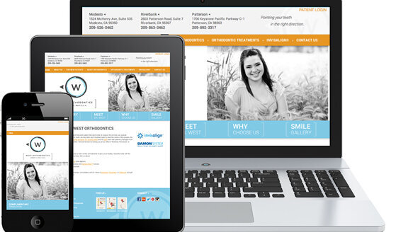
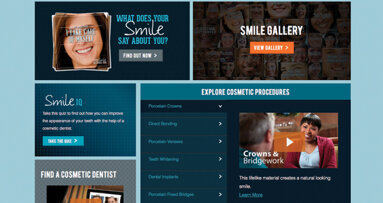
Today’s prospective patients are using their smartphones, laptops and tablets to search for and check out practices like yours. To turn these site visitors into patients, your practice website must be mobile friendly, accurately present the information consumers are seeking, accurately represent your brand and provide a clear call to action no matter which device the visitor is using.
Upgrading your practice’s website to adopt certain design principles, also known as “responsive design,” will enable your site to look and function effectively across all devices and screen sizes. This can significantly impact new patient flow, referral success and, ultimately, case starts and profitability. Here are three ways your practice can benefit from doing so.
1. Improve prospective patient experiences
Mobile devices have become more advanced, and consumers now expect more out of their web-browsing experiences. On a typical day, a prospective patient might browse the web on a smartphone, a laptop and a tablet, each with a distinctive screen size and web browser platform. No matter which device your patients use, they want to have an optimal experience with your website, not a version that has limited functionality on other devices. In fact, 61 percent of those who visit a website that isn’t mobile-friendly will leave the site to visit a competitor. [“Mobile-friendly sites turn visitors into customers.” Google. September 2012.]
By optimizing your website experience for mobile users, responsive designed sites ensure that your practice puts its best online foot forward, on every device and screen size, every time.
2. Increase social media referrals
You work hard to create a great experience for your patients. Make it easy for them to share their experience with their social media networks!
If a new patient has a great first visit at your orthodontic practice, he might post a status update on Facebook from his smartphone, which includes a link to your website. Several of his friends — some on smartphones, some on tablets, others on laptops — might then see his post and click the link. With responsive design, everyone on your patients’ social networks will view your site exactly as it was designed to be viewed, ensuring you make a great first impression online.
3. Be better prepared for the future
New devices and screen sizes are constantly entering the marketplace, and your patients will continue to take advantage of them. If your site has a responsive designed framework, you won’t have to worry about building another app or adding another separate website for a specific device category.
Invest in a responsive site today, and your practice will continue to garner increased visitors and new patient calls regardless of what new devices come to market.
Note: This article was published in Ortho Tribune U.S. Edition, Vol. 8, No. 5/6, Fall 2013 issue.
According to Pew Internet, 45 percent of American adults owned a smartphone as of December 2012.[1] As these powerful devices increasingly make their way ...
As of January 2014, 58 percent of adults Americans owned a smartphone.[1] With the continued advancements in cellular networks and expanded device ...
Orthodontics is holistic dentistry. Surely that is correct. We, as prudent orthodontists, do not just treat a malocclusion; we treat a human being who ...
CHICAGO, US: Fewer young dentists are buying practices early in their careers—but that does not mean they are abandoning the idea of ownership altogether....
The clock is ticking. In 2025, your website is your front desk, your waiting room and your first impression. If your site is more than four years old — ...
NEW YORK, N.Y., USA: The American Academy of Cosmetic Dentistry (AACD), the world’s largest non-profit membership association dedicated to the art and...
For decades, dentists around the world have profited from high demand for dental clinics by selling to a dental support organisation (DSO), entering ...
In today’s rapidly changing health-care environment, 3-D imaging is becoming an essential tool for diagnosis and treatment in dental and specialty ...
The COVID-19 outbreak has certainly tested us all — our patience, our sanity and our preparation. We’ve been awarded (yes, we think it’s a good thing)...
Pop quiz: Do you know — right now — the biggest pulse points affecting your business in 2014? If your answer is “Sure, I can figure that ...
Live webinar
Wed. 8 April 2026
1:00 PM EST (New York)
Live webinar
Thu. 9 April 2026
1:00 PM EST (New York)
Live webinar
Thu. 9 April 2026
2:00 PM EST (New York)
Prof. Moritz Kebschull, Cat Edney
Live webinar
Fri. 10 April 2026
10:00 AM EST (New York)
Live webinar
Fri. 10 April 2026
11:00 AM EST (New York)
Dr. med. dent. Henrik-Christian Carl Hollay
Live webinar
Fri. 10 April 2026
12:00 PM EST (New York)
Prof. Dr. Ali Murat Kökat


 Austria / Österreich
 Bosnia and Herzegovina / Босна и Херцеговина
 Bulgaria / България
 Croatia / Hrvatska
 Czech Republic & Slovakia / Česká republika & Slovensko
 France / France
 Germany / Deutschland
 Greece / ΕΛΛΑΔΑ
 Hungary / Hungary
 Italy / Italia
 Netherlands / Nederland
 Nordic / Nordic
 Poland / Polska
 Portugal / Portugal
 Romania & Moldova / România & Moldova
 Slovenia / Slovenija
 Serbia & Montenegro / Србија и Црна Гора
 Spain / España
 Switzerland / Schweiz
 Turkey / Türkiye
 UK & Ireland / UK & Ireland
 International / International
 Brazil / Brasil
 Canada / Canada
 Latin America / Latinoamérica
 China / 中国
 India / भारत गणराज्य
 Pakistan / Pākistān
 Vietnam / Việt Nam
 ASEAN / ASEAN
 Israel / מְדִינַת יִשְׂרָאֵל
 Algeria, Morocco & Tunisia / الجزائر والمغرب وتونس
 Middle East / Middle East














To post a reply please login or register